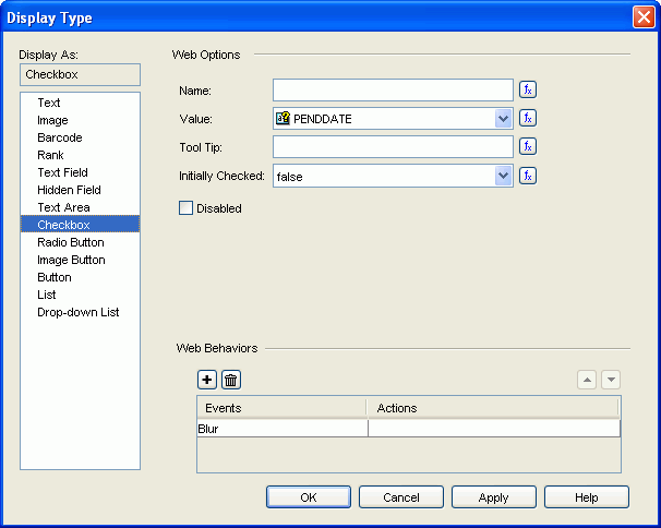
The following are details about options for this display type. See the dialog.
Name
Specifies the name of checkbox. Type the name directly in the text field or use a formula to control it.
Value
Specifies the value of the checkbox. Select the desired field from the drop-down list as the button value, if the given fields cannot meet your requirement, click <Input...> to input the value directly in the text field. You can also use a formula to make it controlled.
Tool Tip
Specifies the tooltip of the checkbox, which will be shown when you hover the mouse over the checkbox after the report is exported to HTML or DHTML. Input the tooltip directly in the text field or use a formula to control it.
Initially Checked
Specifies whether or not the checkbox is selected by default.

Indicates the value of the option can be controlled by a formula. Click this button and select a formula from the drop-down list. If the given formulas cannot meet your requirements, click <CREATE FORMULA> to create one.
Disabled
Specifies whether the checkbox is enabled or disabled.
Web Behaviors
Specifies some web behaviors to the checkbox.


OK
Applies the changes and closes the dialog.
Cancel
Does not retain any changes and closes the dialog.
Apply
Applies all changes and leaves the dialog open.
Help
Displays this help document.