Manipulating data components
You can manipulate data components, which refer to tables, crosstabs, charts and Google maps, in JReport Studio as shown below. Note that, most of the manipulations require selecting the component first. To select a component, click anywhere in the component, when the icon  appears at its upper left corner, click the icon.
Manipulating a table
- Adjusting order of columns in a table
The order of columns in a table can be easily adjusted. To do this, first select a column by right-clicking any cell within the column and selecting Select on the submenu of Table Column, then drag it to the left or right boundary of another column, when a highlighted line appears along the column boundary, release the mouse button, and you will see the order changes.
- Adjusting the width of table columns according to contents
When the contents in cells of a table column need more space to completely display, you can adjust the width of the table column according to the contents. To do this, right-click the column and select Table Column > Autofit from the shortcut menu.
- Changing the table definition
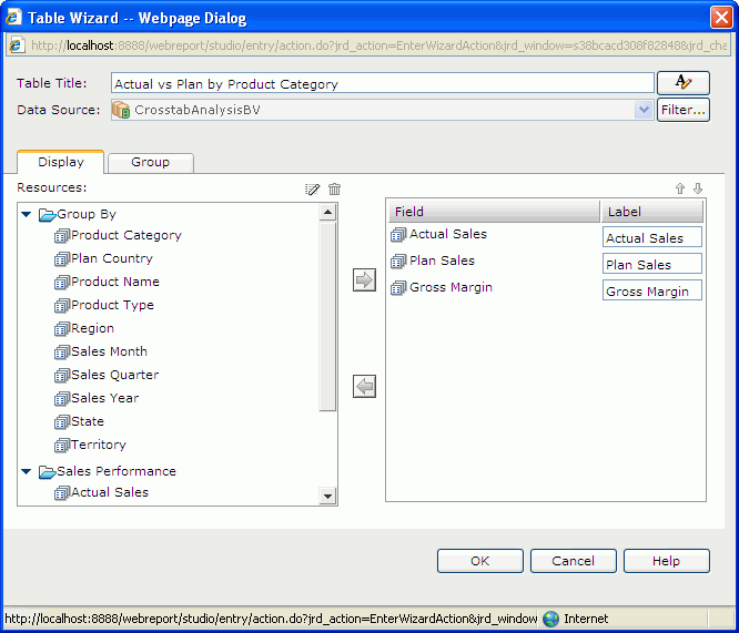
- Select the table and do one of the following to display the Table Wizard. See the wizard.
- Click Menu > Edit > Wizard.
- Click the Table Wizard button
 on the Context toolbar.
- Right-click the icon of the table and select Table Wizard from the shortcut menu.
- In the Table Title text field, edit the title of the table. You can click
 to customize the font, size, and style of the title.
- Click the Filter button to apply some filter conditions to narrow down data displayed in the table.
- In the Display tab, add or change the fields displayed in the table.
- In the Group tab, modify the grouping criteria of the table.
- Upon finishing, click OK to apply the modifications.
For details about how to define a table, see Inserting a table.
- Aggregating on a detail column
You can summarize the data in a detail column. To do this:
- Right-click the detail field and select Aggregate On from the shortcut menu. Or you can first select the column by right-clicking any cell within the column and clicking Select on the submenu of Table Column, then on the Context toolbar, click the Aggregate On button
 .
.
- In the Aggregate On dialog, specify a function from the Function drop-down list to summarize the data.
- When done, click OK.
- If the table has groups, you will find data in each group level and the whole table are summarized respectively in the column.
- If the table has no groups, the summary will be based on the whole table.
When you finish summarizing a detail column, you will find a dynamic aggregation is created at the same time which is given a default name Function_DetailFieldName in the Dynamic Resource > Aggregations list in the Resources panel and you can use it again in the current report if required.
- Adding/Removing groups in a table
You can add more groups into a table or remove the groups that are not required from a table.
- To add a group into a table:
Select the table, then on the Context toolbar, click the Add/Remove Group button  and you will get a drop-down list of fields in the business view that can be used as group by fields. From the list you can select the field you would like to add into the table as a group. If there is no existing group in the table, the added group will be placed at the left-above position. If the table already contains groups, the new group will be added as the highest level group and follow the same position pattern as the closest existing group.
- To remove a group from a table:
Right-click a field of the group and select Delete from the shortcut menu, then click Yes in the message dialog to confirm the removal. Or you can use the Add/Remove Group button on the Context toolbar of the table: unselect the group you want to remove from the drop-down list, then click Yes in the message dialog.
- Showing/Hiding detail columns
To show/hide a detail column, select the table, then on the Context toolbar, click the Show/Hide Detail button  . From the drop-down list, select/unselect the field name to show/hide its detail column.
You can also hide a detail column by one of the following:
- First select the column by right-clicking in the column and selecting Select on the submenu of Table Column, then do either of the following:
- Click the Hide button
 on the Context toolbar.
- Right-click the column and select Hide.
- Right-click in the column and select Table Column > Hide from the shortcut menu.
- Showing/Hiding summaries
To show/hide a summary from a table, first select the table and then do either of the following:
- On the Context toolbar, click the Show/Hide Summary button
 . From the drop-down list, select/unselect the summary field name to show/hide it.
- Right-click the icon of the table, then on the shortcut menu, select/unselect the summary field name from the Show > Table Column submenu to show/hide it.
Manipulating a crosstab
- Changing the crosstab definition
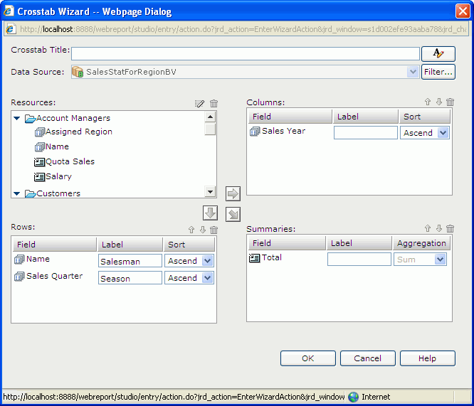
- Select the crosstab and then do one of the following to display the Crosstab Wizard. See the wizard.
- Click Menu > Edit > Wizard.
- Click the Crosstab Wizard button on the Context toolbar.
- Right-click the icon of the crosstab and select Crosstab Wizard from the shortcut menu.
- In the Crosstab Title text field, edit the title of the crosstab. You can click to customize the font, size, and style of the title.
- Click the Filter button to apply some filter conditions to narrow down data displayed in the crosstab.
- Change the fields and summaries used by the crosstab.
- Upon finishing, click OK to apply the modifications.
For details about how to define a crosstab, see Inserting a crosstab.
- Converting a crosstab into a chart
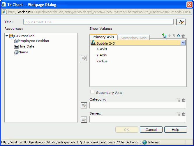
- Select the crosstab and then do either of the following to display the To Chart dialog. See the dialog.
- Click Menu > Edit > To Chart.
- Right-click the icon of the crosstab and select To Chart from the shortcut menu.
- In the Title text field, input a title for the chart. You can click to customize the font, size, and style of the title.
- The Resources box lists all the view elements used in the selected crosstab including group and aggregation objects. The chart can only be defined based on the view elements listed. Select the required chart type from the chart type drop-down list. Add a group object
 from the Resources box to the Category box, and so to the Series box, and aggregation objects
  to the Show Values box respectively.
If you select a bubble chart type, you need to specify the fields to be shown on the bubble X axis, Y axis and the value you want to show as the bubble radius in the Show Values box. Note that when you specify a value for the bubble X axis, this value will be displayed on the category axis instead of the one specified in the Category box. However, the value defined in the Category box will also be included in data calculation.
- Click the OK button to finish the conversion.
For details about how to define a chart, see Inserting a chart.
- Rotating a crosstab
Columns and rows in a crosstab can be exchanged. This operation is called rotating a crosstab.
To rotate a crosstab, first select it, and then do one of the following:
- Click Menu > Edit > Rotate Crosstab.
- Click the Rotate Crosstab button
 on the Context toolbar.
- Right-click the icon of the crosstab and select Rotate Crosstab from the shortcut menu.
- Adjusting the width of crosstab fields according to the contents
When the contents in the field of a crosstab need more space to completely display, you can adjust the width of the field according to its contents. To achieve it, right-click the field and select Autofit from the shortcut menu.
Manipulating a chart
- Changing the chart definition
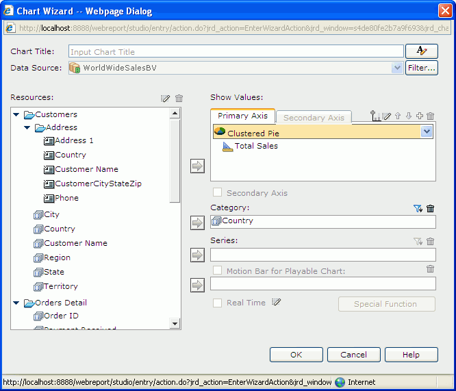
- Select the chart and then do one of the following to display the Chart Wizard. See the wizard.
- Click Menu > Edit > Wizard.
- Click the Chart Wizard button on the Context toolbar.
- Right-click the icon of the chart or any part of the chart other than the legend and label, then select Chart Wizard from the shortcut menu.
- In the Chart Title text field, edit the title of the chart. You can click to customize the font, size, and style of the title.
- Click the Filter button to apply some filter conditions to narrow down data displayed in the chart.
- Change the values displayed on the chart.
- Upon finishing, click OK to apply the modifications.
For details about how to define a chart, see Inserting a chart.
- Formatting chart elements
You can format the chart graph, platform, paper, legend, X and Y axes, wall, floor, and gridlines using the corresponding format command on the shortcut menu of a chart. For details about the element properties, refer to the specific format dialog in JReport Studio dialogs.
- Sorting category/series labels
You can sort the labels on the category or series axes of a chart in either descending or ascending alphabetical order. To do this, right-click the chart, then on the shortcut menu, select the required order from the Sort Category or Sort Series submenu.
- Swapping chart groups
You can switch data between the category and series axes, or between the category and value axes of a chart if no field on the series axes.
To swap the chart groups, first select the chart, then do either of the following:
- Click the Swap Chart Groups button
 on the Context toolbar.
- Right-click the icon of the chart or any part of the chart other than the legend and label and select Swap Chart Groups from the shortcut menu.
- Converting a chart into a crosstab
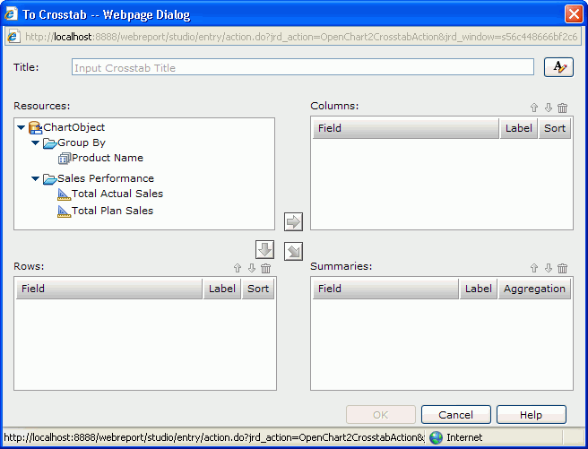
- Select the chart and then do either of the following to display the To Crosstab dialog. See the dialog.
- Click Menu > Edit > To Crosstab.
- Right-click the icon of the chart or any part of the chart except for the legend and label and click To Crosstab on the shortcut menu.
- In the Title text field, input a title for the crosstab. You can click to customize the font, size, and style of the title.
- Select a group object in the Resources box and click
 or
or  to add it as a group field to the Columns or Rows box; select an aggregation object or a detail object
  and click
  to add it as an aggregate field to the Summaries box. If a detail object is added, specify the aggregate function for it in the Aggregation column. Repeat this to add more group and aggregate fields.
In the Label column, you can edit the label of a group field or aggregate field, and the Sort column allows you to specify a sorting manner on a group field.
If you want to remove any group/aggregate field, select it and click  .
.
To adjust the order of group/aggregate fields, select a group/aggregate field and click  or
or  .
.
- Click OK to finish the conversion.
Note: Additional values are supported only in chart. If you convert a chart with additional values into crosstab, the additional values are not converted together with the chart.
- Changing chart type
Select the chart, then on the Context toolbar, click the Chart Type button  . From the drop-down menu, select the desired chart type and its subtype.
- Changing legend position in a chart
Chart legend can be placed at the top, bottom, left or right position in a chart. To change the legend position, select the chart, then on the Context toolbar, click the Chart Options button  . From the drop-down menu, go to the Legend submenu and select the desired position.
- Showing/Hiding labels on the X/Y axis
Select the chart, then on the Context toolbar, click the Chart Options button . From the drop-down menu, go to the Label submenu, then select/unselect the desired labels to show/hide them.
- Showing/Hiding X/Y gridlines
Select the chart, then on the Context toolbar, click the Chart Options button . From the drop-down menu, go to the Gridlines submenu, then select/unselect the desired gridlines to show/hide them.
When gridlines are shown, it is better to also have the wall shown so as to make the background gridlines more intuitive. To show the wall, follow the steps above, then on the Gridlines submenu, select Wall.
Going up/down on Google map group markers
- For the group level that is higher than some other group levels in a Google map component, point to its group marker, right-click it and select Go Down from the shortcut menu to jump one group level down.
- For the group level that is lower than some other group levels in a Google map component, point to its group marker, right-click it and select Go Up from the shortcut menu to jump one group level up.